Monday, December 11, 2006


Production Processes Brief One

The Company i am looking at is a Media Production Company called Boomernag, based at 218 Penarth Road Cardiff . Initialy established in 1994, the Boomerang group has grown to become one of the most successful media production companies in Wales. Boomerang is most known for producing entertainment, extreme sports, factual, musical, as well as radio programming; producing work for S4C, ITV, BBC, Channel 4, Channel 5 and Sky Sports to name but a few. A recent acquisition between two local production companies Fflic and Alfresco, has expanded Boomerang's talent base considerably. This means the compamy now also produces programmes for genres such as children's, lifestyle, comedy, drama and documentary.

I now intend to analyse the companys website, http://www.boomerang.tv/ I intend to assess how well the web-site is designed visualy and determine if the written content on the website is appropriate.


What are the major strengths and/or limitations of the way the information has been organised?

Boomerang's website is presented as a simple html site. It is much more heavy in written content than visual, though simple text and layouts are used throughout. Apart from providing approriate company contact information, the content is clearly provided to give an overview of the work Boomerang develops. Unfortunately apart from describing the programmes the company makes, the lack of visual content makes the site look rather bland. Furthermore, it would be better if more visual examples of the programmes Boomerang produce were included on the site as this would provide greater clarity.

Has the information (text and images) been appropriately edited and structured?

The overall written & visual content is presented in a professional manor. It is clear from the design that the company is aiming to attract high profile clientel. This is done through the use of simple text and layouts. The website is also viewable both in English and Welsh.

Is the hierarchy clear?

The hierarchy of the design is both simple and easy to use. The information is well organised into different categories; about, television, radio, extreme sports and contact. The navigation bar is always situated at the top of the page, with the changing written content appearing below.

Is legibility good?

The legability is good throughout the website. The text is clear and easy to read on the dark background, with the design of the text being designed with a clear font and good size.

Is Readability good?


The readability is good, although a little heavy in places. The language is easy to understand, with no unnessesary termonology that could confuse the reader.

Are images used to give information or just decorate the pages?

The few images used on the pages are mainly there for decoration, however they do relate to the content of the information of the page that they are on.

Is colour used to clarify the information or as an expressive add-on?


The pages are dark blue to tie in with the company logo, with the text written in white. This use of white over a dark background helps to clearly present the information to the viewer, with bold being used to highlight headings and important points.

Friday, November 10, 2006

PERSONAL PROJECT - RESEARCH PAPER PRO FORMA

1. Your general field of enquiry.

I have decided to examine a humanitarian topic which is relevant to us all, ‘freedom of speech.’ Freedom of speech is enshrined in the United Nations Universal Declaration of Human Rights and is granted formal recognition by the laws of most nations. Nonetheless the degree to which the right is upheld in practice varies greatly from one nation to another. In many nations in the developing world strict censorship is enforced, while even among liberal democracies there are different approaches to issues such as hate speech, obscenity and laws.
Freedom of speech is a fundamental principle that provides people with the right to speak their thoughts in public. However, there has been much discussion on this topic lately, especially in the media in light of the 9/11 terrorist attacks in America and the 7/7 attacks in Britain. As a result of these terrorist attacks, both the U.S and U.K governments have introduced new legislation & laws to help combat their war on terror. However, they are not without opposition from those who feel they are impeding on our civil liberties & rights.
Does freedom of speech permit a person to arouse fear or hatred? It is true that freedom of speech can be abused. Nevertheless, this freedom is so important that surely every precaution should be taken to protect those who call upon its guarantee. Freedom of speech continues to be problematic as well as important. I have just read an article where the Ku Klux Klan were given permission to hold a rally in a town in America & received police protection; then they were sent a bill for the additional security. When the Klan protested, the court decided that the group did not have to pay. It is easy to say that the Klan should be silenced because its message is objectionable. However, if one group with objectionable views can be silenced, it soon may become acceptable to silence another group, and then another group. In this light, I am reminded of the Pastor Martin Niemöller famous poem "First they came..." and feel its words & message still ring true today “When they came for me, there was no one left to speak out.”


2. Your chosen subject.

I intend to research & examine the specific issue of Internet Censorship. Internet censorship is control or suppression of material an individual can publish or access on the Internet.The legal issues are similar to offline censorship. One difference is that national borders are more permeable online: residents of a country that bans certain information can find it on websites hosted outside the country. Conversely, attempts by one government to prevent its citizens from seeing certain material can have the effect of restricting foreigners, because the government may take action against Internet sites anywhere in the world, if they host objectionable material.
Total censorship of information on the Internet however is very difficult to achieve due to the underlying distributed technology of the Internet. Data havens (such as Freenet) allow unconditional free speech, as the technology guarantees that material cannot be removed and the author of any information is impossible to link to a physical identity or organization.
However, this does not mean that governmental originations throughout the world are not trying to implement forms of censorship. The recent (September 2004) international operation against the anti-globalization Indy-media network, led to the knock down of several servers worldwide. So this shows that the era of completely free internet is finished. Even in democratic countries the authorities have now the technical and legislative means to shut down anybody on the net, for any good or evil reason. In the United Kingdom, the new Home Office Minister Vernon Coaker set a deadline of the end of 2007 for all Internet Service Providers to implement a “Clean feed” style network level content blocking platform. Currently, the only web sites ISPs are expected to block access to are sites the Internet Watch Foundation has identified as containing images of child abuse. However such a platform is capable of blocking access to any web site added to the list, making it a simple matter to change this policy in future. The Home Office has previously indicated that it has considered requiring ISPs to block access to articles on the web deemed to be “glorifying terrorism”, within the meaning of the new Terrorism Act 2006.

Levels of Internet censorship vary from country to country as previously discussed. Some countries impose stricter regulations and penalties than others. In total there are 61 Cyber dissidents imprisoned to date in various countries for illegal web bloggings and other forms of expression or statements against their governments, with this number ever increasing. In November 2006, governments and companies from all over the world will attend a UN conference to discuss the future of the Internet. This could pen ultimately mean that the face of the Internet as we know it will change. For this reason, I feel it is something that needs to be examined and is in everyone’s best interest that the results are made freely available to the masses.


3. Your objectives. What are you going to document/ uncover/ explain/ question?

In this time of regulation, freedom is really threatened on the Internet. There are peoples who try to monopolize the net, see to censor it, openly or hypocritically, be it is in the name of the defence of the order or in the name of freedom. There are those who agree with censorship, but one is compelled to ask “to what extent?” Denial of inappropriate images of minors for example is something I would hope everyone would see as a good thing. But what about censoring articles with strong religious or political beliefs because the opinions held are not your own? I believe it is imperative that a balance should be reached between censorship of explicit material and freedom of speech.
I wish to obtain an understanding of the current state of affairs throughout the globe in this issue. Firstly I must discover what forms of expression on the internet are under attack. I then intend to examine how special governmental bodies and interest groups suppress the right to free speech on the internet by attempting to silence anyone whose opinions do not conform with their agendas. After I discover what means are used to suppress free speech (e.g. smart filter, websense), I wish then to develop my project further by looking at what tools are available (e.g. Freenet) to help protect those who do not have the fundamental right of free speech..
Having done all this, I intend to present my findings in a professional journal. I am currently looking for an appropriate place for publication among organisations such as Amnesty International (Irrepressible campaign) and Reporters without borders etc. Above all I hope to present a coherent and well balanced report, which draws upon all the issues of Internet Censorship & which presents the reader with a good understanding of the these issues.


4. A description and assessment of research base. Primary sources. Secondary sources.

Much of my primary research will comprise of distributing Questionnaires, e-mails and letters to the appropriate persons. Case studies will be conducted into various countries to gain an understanding of the scale of internet censorship and the resulting penalties for braking set laws, be they an individual countries or international.
The secondary sources I will use will include books, videos, journals and articles on the internet. Although many articles, particularly on the internet may be bias or inaccurate, they will still be invaluable to my findings and understanding of the issue.
5. An indication of your preferred methodology and why it is appropriate. What academic approach will you choose that is best suited to the analysis, contextualisation and cultural critique of your subject?

Researching into this issue could be particularly difficult. Because this is such a profound issue for many people and because there are those who wish to distort the truth, individual agendas may play heavily on the information I find. Fortunately I have a background in Historical study and have had much experience of using primary and secondary sources. Therefore I am aware of the problems that bias and inaccurate information can cause, but should also be able to identify such issues.
When my research is complete, the academic approach I intend to use to analyse my findings will take the form of a philosophical discussion. I am concerned with the issue of Internet censorship and apart from just looking at the technical capabilities available to enforce this censorship and how to overcome them. I also intend to present an unbiased philosophical discussion, citing the works of key thinkers & philosophers. I think this would be particularity appropriate because it would allow me to gain a full understanding of the issues for and against internet censorship, before writing a conclusion on where I stand on the issue & presenting my finished project.
Furthermore, I intend to use appropriate law based methodology when I come to present my findings into the kinds of penalties issued for breaking censorship laws.


6. References to key thinkers/academics.


Isaiah Berlin (Political philosopher and Historian of ideas. 1909 - 1997).
Jeremy Waldron (Professor of law and philosophy at the New York University School of Law. 1953 - present).
Jonathan Wolff (Professor and Head of Department specialising in political philosophy at University College London. 1959 - present).
Bernard Williams (Professor of Philosophy at the University of Cambridge,1929 - 2003).
Ronald Dworkin (American legal philosopher, 1931 - present).
H. L. A. Hart (Legal philosopher, 1907 - 1992).
Jean-Jacques Rousseau (Philosopher of the Enlightenment, 1712 - 1778).

7. Indicative bibliography.

Freedom: An Introduction with Readings by Nigel Warburton
(Routledge, an imprint of Taylor & Francis Books Ltd. 14 Sep 2000).

The New Thought Police by Tammy Bruce
(Crown Publications. Jan 2003).

http://irrepressible.info/ (Amnesty International Campaign).
http://opennet.net/map/ (Internet Filtering Map).
http://www.rsf.org/ (Reporters without Boarders).
http://www.ispa.org.uk/ (The Internet Services Providers' Association. ISPA UK).
http://www.netfreedom.org/ (Free speech organisation).
http://www.eff.org/br/ (Electronic Frontier Foundation. Free speech organisation).
http://www.epic.org/crypto/ (Electronic Privacy Information Centre).
http://www.scripting.com/twentyFour/ (A Celebration of Free Speech on the Internet).


8. Additional information that is relevant.

Time willing, I would like to present my project not just in written form, but also in some kind of multi-media format. I wish to create either a video, e book, website or some other form of multi-media presentation. A written dissertation or journal may be appropriate for presenting my finding to an academic body, but I also wish to present my work in a form that is more accessible to a larger audience.


9. Any questions you may have for staff.

Having discussed this topic with S. Pope on the 30/10/06, I am happy that I have a credible and above all interesting proposal for a project. I will require further discourse soon, although I am happy to talk about my proposal at any time.


User Centered Design
Re-Design of Nintendo DS Lite


Introduction

In a previous module I looked at the Nintendo DS Lite handheld gaming console and discussed the products usability and HCI issues. I now intend to take an user-centred approach, to redesign and make an improved prototype of this product. This article concludes with an evaluation of my redesigned prototype using Nielsen’s Discounted Usability Engineering method (‘DUE’).


Stage One - Redesign

To help identify user needs and requirements, I conducted a focus group with several friends who own or have used a Nintendo DS, as well as some who had never used one before. I wished to observe how people used the system and also hoped to identify any problems people had when using it. Furthermore, I was keen to learn what people thought was positive about the device and what could be done to improve it’s usability.

Several user issues and observations were identified. Firstly some users had sensitivity issues with both the D-Pad and the Touch Screen, meaning the user had to press down much harder in some games than others. There are also reliability issues with it’s built in Microphone; this is apparent in such games where the user is asked to interact with the game by blowing into the Microphone.

Some users commented that the DS is not exactly ergonomic. The rectangular base is reminiscent of a slightly smoothed NES controller, meaning you cannot wrap your palms all the way around it. However, whether in use with the normal controls, stylus or the thumb strap nobody complained of the device being uncomfortable to use. Nobody experienced any hand cramps which often plague some owners of small handheld devices who use them for prolonged periods.

On the positive side, I received an overwhelmingly positive response with regards to the devices usability & interface. To test usability and to see how effective the interface is, I asked all my participants to perform a simple task; switching the device on > loading a game > playing the game > switching the device off. Users reported that all the buttons on the interface are clearly marked and there is not too many either, with no unnecessary buttons that could confuse the user. As for the devices interface and menus, they are laid out and presented extremely well. There are large icons, with not too many options and diagrams to help reassure the user they are selecting the correct option. (A run down of the main Menu screen is presented below).


Top screen

1. Tool Bar - This displays the users name, the time on a 24 hour clock and the date.
2. Clock - Displaying the time.
3. Calendar - Displaying the date.

Bottom Touch Screen

4. Game Option File - Select this to play if a game is inserted. When a game is inserted, It displays the games name in text and also has a relevant picture.
5. Pictochat - This option file is for instant chat software which allows DS owners to communicate with each other, much like MSN messenger or Yahoo messenger.
6. DS Download Play - This option allows DS owners to download game patches off other DS owners so they can play each other wirelessly.
7. Game Pak - This option becomes visible when a game pak is inserted.
8. Settings - This option allows the user to change the devices settings, e.g. time, date, brightness, user information.

One innovation that was discussed was whether the inclusion of an analogue stick would be appropriate. However, as I discovered with the DS lower touch screen, it has the potential to offer similar functions as an analogue controller, but with greater interaction. PC shooters for example have had the advantage of mouse look, which gave a whole new dimension of immersion. But with the DS, games like Metroid Prime Hunters brings mouse look control into your pocket. With the default controls, the action plays out on the top screen and you use the touch screen and stylus to look around, whilst the D-Pad move you around and the triggers fire. So tasks preformed with conventional analogue sticks can also be preformed with greater effect with the DS stylus or thumb stick on the touch screen.

I also conducted internet based research to determine what other problems Nintendo have had with the production of the DS console. Even though the overall opinions are positive, there has been one or two manufacturing issues. There has been problems with the outside casing, with cracks appearing on the hinge nearest the left shoulder button. This problem is purely cosmetic and does not affect the game play or console whatsoever. Other users have reported dead or stuck pixels, although this is pretty common amongst TFT screens.

By conducting user testing I have learned that many of the problems the DS has is with it’s hardware and issues that arise after the manufacturing process. As for usability, the device has a clearly defined menu which is simple to navigate. It is similar to a mobile phone menu and incorporates similar design traits. Seeing there are no clear problems with the ergonomics or usability of the device, I have decided to focus my redesign work on the aesthetical appeal of the DS. I had the intention of creating a product which would incorporate all the features of the original, but would bring something new to the table and could still be incorporated into the existing Nintendo DS products line.

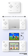
After completing several rough sketches, the concept I came up with was that of an expandable device, with a flip top screen (shown below). Apart from incorporating the new features of the expandable design with a flip screen, this design has the advantage of being smaller than the DS Lite when it is not in use. Meaning it takes up less room on your person and when in storage. Something else I think could be an interesting concept would be light up buttons (e.g. Red LED buttons). This feature could then be used for such games where the user is required to press a button at a certain time (e.g. Dance games).


Stage Two - User Testing

For this stage I was required to evaluate my redesigned prototype using Nielsen’s Discounted Usability Engineering method (‘DUE’). A method of user testing was difficult to realise with my redesign. As I found the DS has excellent user interaction qualities, I am only concerned with testing the ergonomics and aesthetical appeal of my redesign. I decided against creating a High-fidelity 3D prototype, predominately because I was not changing the Devices interface. Furthermore, you navigate the menus and select options through the touch screen, so a visual representation on a computer could be considered too artificial. Other factors for this decision include the high costs that would be involved, lack of time and lack of software. For these reasons Instead I created two Low-fidelity prototypes by printing off an image of my redesign and placing it onto blue foam; one of the console closed & another with the flip screen open. This approach has the advantage of being very cheap and quick to create, although it does not give me as much or as accurate information as a high-fidelity prototype would.

To conduct the trial, I asked each individual in the focus group to hold first the original Nintendo DS Lite console and then my two redesigned blue foam models. I then asked them to simulate performing various actions, so I could discover if the device was comfortable to use and that all the buttons were in a practical place.

Results

As I made my redesign with the original DS Lite in mind, I incorporated many of the originals key characteristics. I believe it is because of this reason that I received overall positive feedback. Users reported that they found the device to be more practical because it fitted into their pockets easily. Because the button layout is similar to the originals, nobody could see any user interaction issues. Furthermore, as the device is the same size as the original when it is in use, users reported no problems with the ergonomics of the new design. However, It was pointed out that my blue foam models did not effectively show how the device opened or how the flip-screen operated.

Nielsen’s Discounted Usability Engineering method (‘DUE’)

Simple and natural dialogue

Short precise langue is used to not confuse the user.

Speak the users’ language

A wide age-range of people would use this device. For this reason it is important that language is kept simple and to a minimum.

Minimise the users’ memory load

The amount of operations a user can perform are kept to a minimal, not to overburden the users memory load. This device is predominately used for playing games, one main menu screen means that options are kept to a minimum.

Consistency

The Language and Visuals used are consistent throughout the console. Information is presented in the same format and location throughout. This gives the users more confidence in using and exploring the system.

Feedback

Loading screens appear to reassure the user. They are never left in any doubt about the system state or what is happening. Fortunately the system does not have a long response time for the actions you ask it to perform, so in-depth user feedback is not needed.

Clearly marked exits

If a user makes a mistake or accesses a option they did not intend, exit boxes are always situated on the top right of the screen. This is consistent with the layout on many computer programs.

Shortcuts

Few shortcuts are provided because of the minimal operations you can perform on the device and because they are not needed in game play.

Good error messages

Error messages are a rarity. When they do appear, they are in plain and clear language, avoiding the use of obscure codes or technical jargon which could confuse the user.

Help and documentation

A short precise manual is provided that explains all the key operations effectively without overburdening the user.

Tuesday, October 17, 2006

Brief Three - U.C.I.

'Analyse an Arcade Machine.'

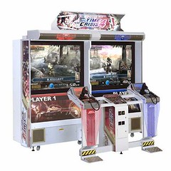
Having visited the UCI down Cardiff Bay, I have decided to write about an arcade machine I found there called 'Time Crisis 4.' Unfortunately when I went to the UCI there was not many visitors, so I ended up spending all my money to ensure I understood the HCI/Usability of the machine.

Observations & Interpretations

Time Crisis 4 is an interactive, one to two-player cooperative gun game. Specifically it is a first person Rail Shooter and is presented in a upright, twin cabinet (two screens). Players have the option to select either dual-player cooperative game play or dual single play in the same cabinet. I make this point because this use of multi-screens is highly innovative and original in an arcade machine.

As for the game itself, players are navigated through three stages & each stage consists of a prologue and three areas. The user is provided with a plastic light gun to interact with what is happening on the screen & has an in-game arsenal which includes a standard handgun, machine gun, shot gun and grenade. Players change weapons in the game by pulling the trigger while they hide (you hide by taking your feet off the foot pedal).

Forms of interaction

The main form of interaction the user has with this device is by shooting the enemies as they appear on the screen. The user is navigated automatically from scene to scene by the game. To assist players, they are guided through the three stages with the support of Voice Navigation, which comes from a speaker mounted on both players gun racks. The Voice Navigation provides players with instructions on selecting the appropriate weapons and timing their next move.
There is a also a foot pedal which players use to hide behind boxes and walls when the action becomes too intense. Players are also required to reload their weapons, like a real gun. This is achieved by aiming off screen and pulling the trigger button. In additional, players have the option to adjust the gun sight and select the blowback to on or off.

One other form of interaction Time Crisis 4 offers is the ability for players to control their fate, by offering multiple scenarios. Players are able to choose the direction they proceed at various points in the game; they can choose either right or left by pointing the gun at arrows located on the sides of the screen.

Is the interface design metaphorical?

The interface of this device is indeed metaphorical. The user is presented with a plastic imitation light gun and is placed in realistic gun fights, where they have to shoot and reload weapons and kill enemies in order to progress. The enemies are not passive and they fire back at the player, symbolised by red flashing holes when hit.

How do the exhibits in the UCI differ from those in Techniquest?

The exhibits in the UCI are all entertainment based, while the devices in Techniquest have an emphasis on education. The arcade machines in the UCI are intended to make money, so it is reasonable to assume they are aimed at young people with disposable income. These machines earn money every play, so the longer they keep the user entertained, the more money they make. This differs from Techniquest, where you pay upon entering to use all the machines as many times as you like.

Please click link for additional photos http://www.flickr.com/photos/64946738@N00/sets/72157594333222322/show/

Sunday, October 15, 2006

Design for Interaction

Brief Two - 'Nintendo D.S. Lite.'


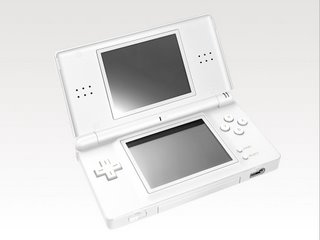
(fig 1) Nintendo DS Lite console.

Initially I was going to discuss the Nintendo Advance gaming console, but fortunately I have been lucky enough to get hold of a new Nintendo D.S. Lite (fig 1). The reasons why I want to discuss this product are because of its unique design qualities, as well as being an appropriate product for the set brief. The device itself is lightweight & portable, with dual screens and has a multimedia interface. This console is relatively new to me, so before writing this I had little prior knowledge of the devices interface, functionality & button layout.


Description of Product and its Functionality.


The Nintendo DS Lite is a dual-screen handheld game console developed and manufactured by Nintendo. It is a slimmer, more lightweight, aesthetically sleeker redesign of the earlier Nintendo DS model. It was commercialy released in Europe during June, 2006 and has sold over 4.15 Million units worldwide (Total DS sales for all models is 22 Million units worldwide). According to Nintendo, the famous Game Boy line of products are aimed at gamers on the move and is intended for use throughtout every day life in multiple environments. Furthermore, this product is meant to symbolise Nintendo’s flare for innovation. Indeed, the letters "DS" in the name are meant to stand for Developers' System, which refers to the features of the handheld, designed to encourage innovative gameplay ideas among developers. It can also stand for Dual Screen(Nintendo DS Frequently Asked Questions).

An interesting innovation Nintendo have made with the DS is that they have incorporated Wi-Fi technology. If you have access to a Wi-Fi Connection, you can connect wirelessly, chat and play with other Nintendo DS owners across the globe. Furthermore you can also connect to local wireless networks, with a wireless range of 30 to 100 feet. This means you can connect with a local wireless network and play up to sixteen players.

As for game compatibility, the Nintendo DS is compatible with Game Boy Advance cartridges (the smaller Nintendo DS cartridges fit into Slot 1 on the top of the system, while Game Boy Advance games fit into Slot 2 on the bottom of the system). The DS is not compatible with games for the Game Boy Color and the original Game Boy, which should be of little concern to most users as these games are now obsolite and are becoming increasingly more difficult to obtain.

Interface Design

The DS Lite weighs in less than the original DS at 218g. It's smaller than the original too at 13.3 x 7.4 x 2.2cm. The device has two screens, the Top Screen boasts a backlit, 3-inch, transmissive TFT colour LCD with 256 x 192 pixel resolution, capable of displaying 260,000 colours. Each three inch screen can reproduce a true 3D view, with impressive 3D renderings. The lower display has the same specs as the top, but is overlaid with a pressure-sensitive touch screen, designed to accept input from the included stylus, the user's fingers, or the "thumb stylus": a curved plastic rectangle attached to the optional wrist strap. The touch screen allows players to interact with in-game elements more directly. This means that you no longer rely on just buttons to move your character or shift perspectives in games. In addition, you can also navigate menus or access inventory items by using the touch screen.

Traditional controls are located on either side of the touch screen. To the left is a D-pad and to the right are the A, B, X, and Y buttons, with small Select and Start buttons below them. Shoulder buttons L and R are located on the upper corners of the lower half of the system. Also on the lower half of the system can be found a clearly defined ‘power’ button, as well as a ‘volume’ button and a headphone slot.

The Nintendo DS also features stereo speakers providing virtual surround sound, located on either side of the upper display screen. This is a first for a Nintendo handheld, as the Game Boy line of systems has only supported stereo sound through the use of headphones or external speakers. There is also a built-in microphone, located below the left side of the bottom screen. It has been used for a variety of purposes, including speech recognition, chatting during gameplay and minigames that require the player to blow or shout into the microphone .

Task Analysis

As this product is predominately used for playing games on the move, I have decided to analyse how the user would perform the task of loading & playing a game like Super Mario Brothers. Below in bullet points are the steps and actions required to perform this task and information on how I knew what to do.

* Firstly I had to insert the Super Mario Brothers cartridge into Slot 1 on the top of the system. I knew to do this because I have played many games consoles in the past & they have all required me to load a game first. Furthermore, I knew to incert the game into Slot 1 because it is a smaller DS cartridge, that would not fit into Splot 2 (for Gameboy Advance games).

* Next I had to press the ‘Power’ button on the left of the console. The button is cleraly labled and again I knew to do this action from past experience. You are made aware that the device is now on because a Green LED display appears (Red appears when there is a low battery).

* When you open the device there are two screens. On the top screen is a clock displaying the time and a calendar displaying the date. On the bottom screen there are several option files, including the Super Mario Bros game file. To select the option file I simply pressed the ‘A’ button, although I could have used my thumb or the provided stylus on the touch screen. This was not initially obvious; I tried pressing the ‘start’ button first, but worked out the appropriate button through a process of elimination.

* At this point the game is now loaded. To start playing and to navigate my character I know to use the traditional D-Pad and the four A,B,Y & X from my previous experience with such consoles.

Please click link for additional pictures- http://www.flickr.com/photos/64946738@N00/sets/72157594333225201/show/

Monday, October 09, 2006

Techniquest - Brief One

Reaction Timer

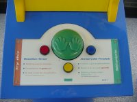
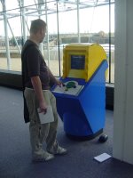
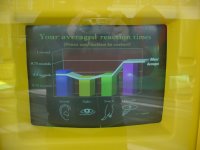
Ones reaction time is very important in many day to day activities, though it is not often measured. That is why I chose to write about a device called the ‘Reaction Timer.’ The machine itself comprises of an upright cabinet, with a colour screen, three interactive buttons (red, yellow & blue) and a green buzzer button. The aim of the device is to obtain a reading of how well the user reacts to a series of predetermined trials; therefore giving an accurate indication of how quickly the users reaction is to these tests. The tests are split into two sections, with eight initial trials concerned with how quickly the user reacts to either a flash of light, on hearing a sound or feeling a vibration on the green pad. Once a flash of light, a sound or the buzzer goes off, the user must press any three of the buttons as quickly as possible. The next series comprises of three more trials under the banner “Thinking timer,” where the user must press a button of the right colour when prompted to. After all the tests are completed, the machine draws a bar graph which gives a visual representation of how well the users reaction to sound, sight, touch and thought is.

Before you start using the machine, the user is asked to either “Choose Red for English or Blue for Welsh.” This means that people who can read either of these two languages can use the device. Specifically the product is aimed at children of primary and early secondary school age, however it is still accessible to older people. It is an appropriate height and has large enough buttons for all such users, although people with disabilities may find it more difficult to use (especially if the user has been unfortunate enough to lose an arm or is hard of hearing).

There are clear educational and entertainment values associated with this device. It is fun to use, with bright colours, making it engaging and entertaining for it’s young intended target audience. It’s educational purpose is to help promote stimulation for young minds and allows the user to engage three of the five senses (sight, touch, hearing). In addition, It’s beneficial to the user because it helps improved concentration and reflexes. However there are a few key flaws with the device, which distort the accuracy of the tests. Firstly the sound it emits is far too quiet to hear & thereafter react too, especially given the noisy surroundings. Furthermore, during the first series of tests the user is asked to “Put one hand on the green pad” to feel for a buzz. When the buzzer goes off, one of the other three buttons must be pressed, which could possibly lengthens ones reaction time. In addition to this, given that the user must have one hand on the green pad at all times, that hand could interfere when reaching for one of the other buttons.

Tuesday, October 03, 2006

Summer Work

Before the start of the course, we were set two briefs to be completed over the summer months. Firstly we were asked to write a short article, with the question "Are tools and toys or film and television new media's closest living relations?" as the focus for our answer. We were also asked to create three picture postcards insired by the places we visited over the summer. Below is the work i did for these briefs.

"Are tools & toys or Film & Television new media's closest living relations?"

If we are to obtain a meaningful understanding and conclusion to this question, we must first fully understand what we define as ‘New Media.’ 'Media' refers to technologies used to communicate messages and include mass media (newspapers, TV, radio), popular media (film, books) and digital media (computer games, the World Wide Web, virtual reality) and others. New Media itself is a relatively new field of study that has developed around cultural practices with the computer playing a central role as the medium for production, storage and distribution.

The first age of media dawned with the invention of the printing press, around C11th. Information could now be distributed through leaflets, books and eventually newspapers. It could be said that Paintings contain messages to its viewer and are a recognized form of media today, but it was the printed word that allowed information to be passed to a mass audience. The next significant change in face for media would not take place until the C20th, which ushered in the radio age. The radio brought about a change of approach. Instead of viewing information in print, a newsreader or DJ read out the information across commercial broadcasts. The face of media continued to change in this centaury with the invention of film & cinema and later on the television. With both these mediums, the receiver of the information is not only a listener, but now a viewer as well. Television opened up a whole new medium to cast news and with later developments in technology, broadcast to anywhere in the world from anywhere in the world.

It was not until very recently that the computer and subsequently the internet came into existence, dawning the age of new media. The internet is a worldwide, publicly accessible network of interconnected computers, which allows us to transform data openly. Internet access these days is not just confined to computer users; it is available through a mass of different mediums. People can access digital information through their PDA, Mobile Phone, even through their television sets by using an Internet Box to name but a few examples. The information available on the internet (News, Radio, Television programs, games, movies, etc) that can be downloaded or viewed is on a huge scale and is expanding rapidly.

In his book ‘The Language of New Media’ Lev Manovich likens the internet to a Russian living in his apartment under the suppression of a Communist dictatorship. Suggesting the internet is not as free as we may think. Some would consider this a radical claim, but this can only be paralleled with those who feel these views incredibly grounded. Manovich also makes several other interesting observations about present day media. Manovich states that modern media tends to try and externalize the “mind life” in an attempt to try and standardize the process so that everything can be controlled. The user follows the instruction on the computer and work in specific steps. This is particularly interesting when concerning video games. Survival in such games then ultimately depends on how well this ‘user’ can learn or assimilate the operations of the computer and then act flawlessly according to its set patterns. Whether you, the ‘user’ operates in Doom or MS Office, the principle remains the same. In that view a video game, which is often celebrated as being very liberating, becomes almost negative, an attempt by the game designer to solicit a certain response.

So according to Manovich, progression lies in breaking beyond linear set pretences. So what does this mean for the future of media? He makes the claim the next generation of digital cinema (broadband or macro cinema) will add multiple windows to its language. One important aspect of visual culture is the status of the screen creating two realities instead of one, two different spaces divided by a frame. According to Manovich, spatiality which was suppressed in the twentieth century will return in the twenty-first.

Television, Radio, newspapers and magazines drove media up until the explosion of the Internet. I believe these instruments of media will stay with us, in one form or another, but none less they are slowly becoming less preferable to the Internet. If you take a news article, the same article can be found, viewed or heard on all of the for-mentioned mediums. The main advantage of the Internet though is that the article can be accessed at anytime. Where as television and radio may only feature it once. The clear positive in this is that information is becoming ever more interactive and easier to manipulate.

It is certainly easy to trace back where modern day media came from. Where it is going though is a little less clear. Media is all around us and will continue to be. Using the transition of paper to radio to television to Internet as a model, it would appear that it is only a matter of time before something new is created, more than likely based on what has come before.

Postcard 1 - Dante Florence

This is the first postcard i produced. It was inspired by the time I spent in Florence, Italy. The scene depicts Dante Alighieri , who wrote 'The Divine Comedy.' In the background is the various levels of hell that was described in Dante's 'Inferno' & also the cursed souls to the left. A famous piece of Florentine architecture is also visibale called the Doma, or Duomo to the locals. This building is a very impressive structure, particularly because of it's rounded or dome like roof, which was highly origional when the building was created.

Postcard 2 - Port Talbot

This is the second postcard i created. Having spent several months in my home town, I felt it necessary to produce an iconic image of Port Talbot.

Postcard 2 - Port Talbot
Originally uploaded by roblonolean.

Whenever I speak to anyone who ventures down my part of the woods, I am often met with the response "I have never visited Port Talbot, but have passed it on the M4 motoway." Port Talbot is instantly recognisable because of the Corus Steel Works domination of the landscape. Port Talbot is a large Industrial Town and as thus could be considered a concrete jungle, with little to no character. That is why the Steel Works is the focus of this postcard.

Obviously picture postcards are meant to be flattering, so I hope the irony is evident. I was considering the phrase "Sights of Port Toilet," but felt the image works well enough!

Postcard 3 - Dylan Thomas copy

This is the final postcard i produced. As a regular visitor to Swansea, I wanted to produce an image with the Bard Dylan Thomas in mind, who was born in Swansea on October 27th, 1914.

Postcard 3 - Dylan Thomas
Originally uploaded by roblonolean.

Dylan Thomas is widely considered one of the greatest twentieth-century poets writing in English and he remains the leading figure in Anglo-Welsh literature. His vivid and often fantastic imagery was a rejection of the trends in twentieth-century verse: while his contemporaries gradually altered their writing to serious topical verse (political and social concerns were often expressed), Thomas gave himself over to his passionately felt emotions, and his writing is often both intensely personal and fiercely lyrical.

He is particularly remembered for the remarkable voice-play Under Milk Wood and for his poem Do not go gentle into that good night which is generally interpreted as a plea to his dying father to hold onto life.

Introduction

Welcome to my Design for Interactive Multimedia blog space. Here you will find work produced by myself for the D.F.I.M. course at U.W.I.C, Cardiff. Throughout the year I intend to keep a monthly Journal which will contain information on the work I am set, as well as my personal reflections. I will also post seperately to this my completed assignments. Relavent links will be added throughout the year to the 'Right' of this page.